The realm of interior paint color psychology is a fascinating field that unveils how different hues can profoundly influence the overall ambiance and emotional response within a home. By understanding the psychological effects of color, homeowners can make informed decisions to create the perfect atmosphere in every room.
This article will explore key color theory principles, examine the distinction between warm and cool tones, and dive into the unique impacts of primary colors. Additionally, we’ll guide developing cohesive color schemes and selecting the best shades for different living spaces. Finally, we’ll discuss incorporating color through accessories and accent pieces to complete the desired aesthetic. Readers will gain valuable insights to transform their homes into vibrant, mood-enhancing environments.
Interior Paint Color Psychology
Color Theory and Emotional Responses
Exploring the fundamental principles of color theory and psychology is the key to understanding how specific hues can evoke distinct emotional responses in individuals. By delving into the psychological differences between warm and cool color tones, we can examine how they can alter a space’s perceived ambiance and overall feel.
Color theory, a design cornerstone, provides a framework for understanding how colors evoke emotions and shape our perceptions of the world. Each hue on the color wheel elicits a unique emotional response, influencing our moods, feelings, and overall interpretations of a particular environment. Embark on a reading adventure with this captivating article.
Warm vs. Cool Colors
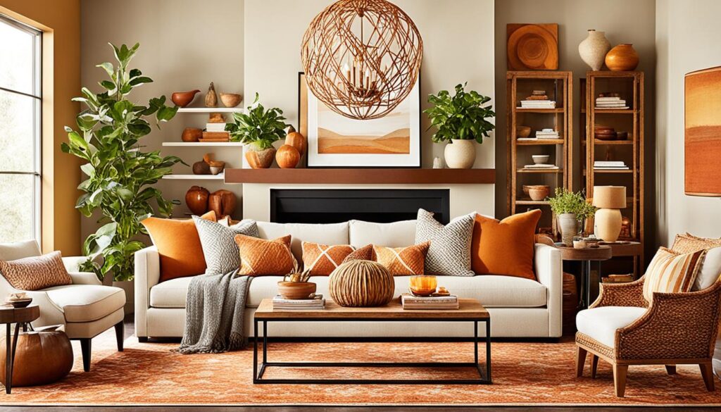
The distinction between warm and cool color psychology plays a significant role in creating the desired atmosphere within a home. Warm tones, such as reds, oranges, and yellows, are often associated with feelings of comfort, energy, and excitement. At the same time, cool colors, like blues, greens, and purples, evoke a sense of calmness, serenity, and introspection.
Psychological Effects of Primary Colors
Delving deeper, the primary color psychological impact reveals how the strategic use of red, blue, and yellow can significantly influence a space’s overall mood and atmosphere. Red, for instance, can stimulate the senses and promote a sense of passion, while blue has a calming effect and can foster a sense of trust and stability. Yellow, on the other hand, is often associated with optimism, happiness, and intellectual stimulation.

By understanding these fundamental color psychology principles, homeowners can make informed choices when selecting interior paint colors that best align with their desired ambiance and emotional responses within the home.
Creating a Cohesive Color Scheme
Cultivating a harmonious color scheme is essential for crafting a visually appealing and cohesive interior environment. Homeowners can achieve a seamless, visually striking aesthetic throughout their living spaces by understanding the nuances of monochromatic color palettes, complementary color combinations, and the strategic use of neutral tones.
Monochromatic Color Palettes
Embracing a monochromatic color scheme involves utilizing various shades and tints of a single hue, creating a sense of visual unity and tranquility. This approach allows for a soothing, unified ambiance that can be particularly effective in bathrooms, bedrooms, and other intimate spaces. Homeowners can experiment with tones of the same color, from light pastels to deep, rich hues, to craft a cohesive and visually captivating design.
Complementary Color Combinations
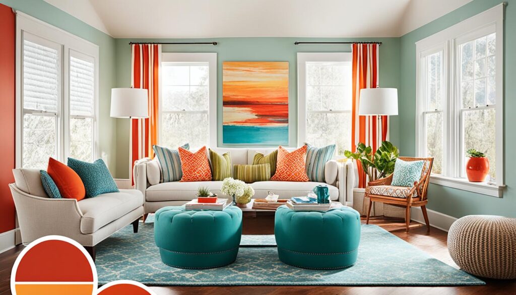
Complementary color combinations can be strategically employed for a more dynamic and eye-catching effect. By pairing colors opposite one another on the color wheel, such as blue and orange or red and green, homeowners can create bold, high-contrast palettes that add vibrancy and energy to a space. These complementary hues, from accent walls to decorative accessories, can be used throughout the home to inject a sense of visual excitement and artistic flair.
Achieving Balance with Neutral Tones
While bold color choices can be captivating, incorporating neutral tones such as whites, grays, and beiges can help establish balance and versatility within a color scheme. These neutral shades can serve as a canvas, allowing the primary colors to take center stage while providing a soothing, harmonious backdrop. Homeowners can leverage neutral tones in their flooring, walls, and larger furnishings, creating a foundation upon which they can layer vibrant accents and personal touches.
Choosing Colors for Different Rooms
In this final section, we’ll provide targeted recommendations for selecting the most appropriate interior paint colors for different rooms within the home. By understanding each space’s unique requirements and desired ambiances, readers will be equipped to make informed color choices that seamlessly integrate with their personal style and lifestyle.
Living Room Color Ideas
When it comes to the living room, consider color palettes that foster warmth, relaxation, and sociability. Warm hues like earthy tones, rich reds, and vibrant oranges can create an inviting atmosphere, while cool blues and greens can instill a calming, serene vibe. Incorporating a mix of these best colors for living rooms can help establish the perfect balance for this multi-purpose space.
Bedroom Color Schemes
In the bedroom, the focus should be on soothing color schemes that promote rest and relaxation. Soft, muted tones like lavender, sage, and dusty blues are known for their ability to induce a sense of tranquility. Pairing these ideal bedroom color schemes with neutral accents can create a harmonious and rejuvenating atmosphere, making it easier to wind down and enjoy a peaceful night’s sleep.
Kitchen Color Trends
When it comes to the kitchen, the latest popular kitchen color trends often highlight the importance of enhancing functionality and visual appeal. Fresh, bright hues like crisp whites, sunny yellows, and calming greens can breathe new life into this essential space, complementing the hardworking nature of the kitchen. Incorporating room-specific color recommendations can help create an aesthetically pleasing kitchen conducive to productive culinary endeavors.
At Painting Done by Angels, we assist those in the Scottsdale & Phoenix, Arizona, area in making their homes and offices beautiful. We offer interior and exterior painting services with 15+ years of expertise. Our family-owned and operated team is licensed and insured, ensuring that your investment is safe with us. We pride ourselves on always delivering the greatest outcomes for our valued customers!