There’s a reason why considering complementary colors is crucial when selecting the perfect paint for your home. The colors we choose can significantly impact the overall atmosphere of a room, affecting everything from our mood to how spacious or cozy the space feels. Understanding the concept of complementary colors and how they work together can make a world of difference in your interior design choices.
Some people underestimate the power of complementary colors when it comes to choosing the right paint for their homes. Complementary colors are pairs of colors that, when combined, cancel each other out. They create a strong contrast and vibrant look when placed next to each other, making them a valuable tool in interior design.
Key Takeaways:
- Complementary colors create harmony: Pairing colors opposite each other on the color wheel can create a visually appealing and harmonious look in your home.
- They add depth and contrast: Complementary colors make each other pop, adding depth and contrast to a room’s design.
- Consider the mood: Different color combinations can evoke different moods, so it’s important to choose complementary colors that align with the atmosphere you want to create in each room.
- Balance is key: While using complementary colors can be bold and eye-catching, it’s important to find a balance in their use to avoid overwhelming the space.
- Test before committing: To ensure you’re happy with your color choices, test complementary colors on a small area or with paint samples before committing to painting the entire room.
Understanding Complementary Colors
Definition and Basic Color Theory
Complementary colors are located directly across from each other on the color wheel. For example, red is complementary to green, blue to orange, and yellow to purple. Understanding this basic color theory is crucial when selecting paint colors for a room. By incorporating complementary colors, you can create a dynamic and visually appealing space.
The Color Wheel and Color Relationships
To grasp the concept of complementary colors fully, it’s imperative to familiarize yourself with the color wheel and color relationships. The color wheel is a circular diagram that organizes colors based on their relationships to one another. Complementary colors, such as red and green, are located opposite each other on the wheel.
Theory suggests that pairing complementary colors in a room can create a harmonious balance. When one color is dominant, and its complement is used as an accent, it can result in a visually striking and well-balanced space. Understanding how these colors interact can help you make informed decisions when selecting paint colors for your home.
Psychological Effects of Complementary Colors
Emotional Responses to Color
The complementary nature of colors plays a significant role in evoking emotional responses in individuals. Complementary colors are those positioned opposite each other on the color wheel, such as red and green, blue and orange, or yellow and purple. These pairs create a dynamic contrast that grabs our attention and elicits specific feelings.
How Complementary Colors Affect Mood
One way in which complementary colors impact mood is through their ability to create a sense of balance and harmony. When used together, complementary colors enhance each other, making them appear more vibrant and engaging. This heightened intensity can lead to different psychological effects, influencing emotions and perceptions.
Another crucial aspect of how complementary colors affect mood is their ability to create a feeling of energy and excitement. For example, pairing blue with orange can evoke a sense of dynamism and enthusiasm. Understanding how to leverage these color pairings can help you set the desired tone and atmosphere in each room of your home.
Complementary Colors in Interior Design
Once again, the importance of complementary colors in interior design cannot be overstated. When choosing the right paint for your home, understanding how complementary colors work together is necessary for creating a cohesive and visually appealing space.
Creating Balance and Harmony
An understanding of complementary colors allows you to create balance and harmony in your home. By pairing colors opposite each other on the color wheel, such as blue and orange or purple and yellow, you can achieve a dynamic contrast that brings energy and vibrancy to a room. The use of complementary colors adds depth and interest to your space, making it more visually appealing and balanced. Enhance your knowledge about What Are The Best Techniques For Painting Exterior Surface Edges And Corners.
Enhancing Room Size and Lighting Effects
Any interior designer knows the power of complementary colors in enhancing room size and lighting effects. By choosing complementary colors for adjacent walls, you can create the illusion of a larger space. For example, painting one wall in a cool color like blue and the opposite wall in a warm color like orange can make the room feel more expansive and open.
Lighting also plays a crucial role in how complementary colors interact in a room. Natural light can enhance the contrast between complementary colors, creating a dynamic and visually stimulating environment. On the other hand, artificial lighting can sometimes dull the impact of complementary colors, so it’s important to consider lighting effects when choosing the right paint for your home.
Choosing the Right Complementary Colors for Your Home
Analyzing Room Function and Atmosphere
Colors play a crucial role in setting the tone and atmosphere of a room. When choosing the right complementary colors for your home, consider the function of each space. For example, warm colors like reds and oranges can create a cozy and inviting atmosphere in living rooms or bedrooms, while cool colors like blues and greens are perfect for calming spaces like bathrooms or offices. Understanding the purpose of each room will help you select complementary colors that enhance the desired ambiance.
Considering Existing Furniture and Accents
With existing furniture and accents in your home, it’s crucial to choose complementary colors that will harmonize with these elements. Consider the color of your sofa, rugs, artwork, and other decor pieces. Matching complementary colors with existing furniture can create a cohesive look and tie the room together. Additionally, contrasting colors can add visual interest and make certain pieces stand out. Strike a balance between coordinating with existing elements and introducing new colors to refresh the space.
Understanding the existing furniture and accents in your home is crucial in selecting complementary colors that will enhance your decor. Take note of any dominant hues present in your furniture pieces and use them as a guide when choosing your paint colors. By harmonizing with your existing decor, you can create a cohesive and visually appealing space that feels well put together.
Popular Complementary Color Schemes
Despite the vast array of colors available for painting your home, complementary color schemes remain a tried and true method for creating visually appealing spaces. By understanding how colors interact with each other, you can achieve balance, harmony, and depth in your home’s design.
Classic and Timeless Combinations
Color combinations like blue and orange, red and green, or purple and yellow are classic choices that have stood the test of time in interior design. These pairs sit opposite each other on the color wheel, creating a dynamic and vibrant contrast that adds interest to any room. When used in equal proportions, these complementary colors can create a sense of energy and balance in a space.
Trendy and Modern Pairings
Schemes that are considered trendy and modern often play with unexpected combinations to create a fresh and contemporary look. For example, pairing soft pastel shades like mint green with coral or teal with blush pink can create a stylish and sophisticated atmosphere. These unconventional pairings add a unique touch to your home décor and can make a bold statement.
Modern color schemes also include pairing neutral tones with a vibrant accent color, such as pairing a soothing gray with a pop of mustard yellow or a crisp white with a bold navy blue. This balance of neutral and bold colors creates a visually striking look that is both modern and timeless.
Application Techniques and Tips
Unlike some color combinations, complementary colors can enhance each other when used together in a space. To make the most of these dynamic pairings, it’s important to use the right application techniques and tips to ensure a harmonious result that complements your home’s aesthetic.
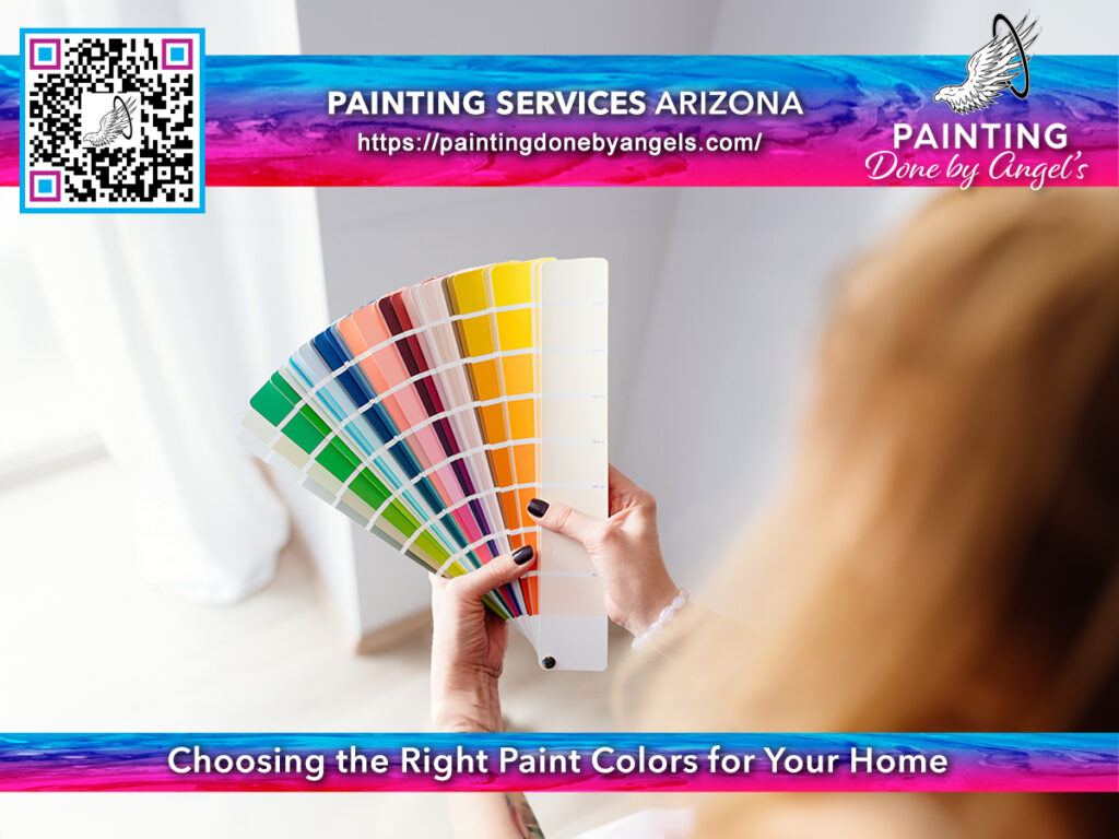
Using Test Swatches for Accurate Representation
An important step in choosing the right complementary colors for your home is to use test swatches to get an accurate representation of how the colors will look in different lighting conditions. This can prevent any surprises once the entire room is painted. Place the swatches on different walls and observe them at various times of the day to see how they interact with natural light.
Knowing how the colors will appear in your space beforehand will help you make any necessary adjustments to achieve the desired effect.
Painting Techniques to Maximize Complementary Colors
The key to successfully using complementary colors in your home lies in the painting techniques you employ. By strategically placing these colors in different areas of a room, you can create a visually appealing and balanced atmosphere. For example, consider using one color for the walls and its complementary hue for accent pieces like furniture or artwork.
Techniques such as color blocking, ombre effects, or creating focal points with complementary colors can elevate the overall look of a space and make a bold statement. Experiment with different painting techniques to see which works best for your home.
Knowing how to apply complementary colors using these techniques can transform your home into a cohesive and aesthetically pleasing environment.
Maintaining and Updating Complementary Colors
When to Refresh Your Color Palette
After spending time carefully selecting complementary colors for your home, it’s important to periodically evaluate whether it’s time to refresh your color palette. An updated color scheme can breathe new life into your space and keep it looking current and appealing. Factors such as fading due to sunlight exposure, wear and tear, or simply a desire for a change can all indicate that it’s time to update your colors.
Adapting Complementary Colors to Changing Trends
Trends in interior design are constantly evolving, and it’s crucial to adapt your complementary colors to reflect these changes. An understanding of current color trends can help you make informed decisions when updating your home’s color scheme. Whether it’s incorporating the latest “it” color or opting for timeless classics, staying abreast of trends can ensure your home remains stylish and visually appealing.
Plus, don’t forget to consider your personal preferences and lifestyle when updating your complementary colors. While trends can inspire, it’s crucial to choose colors that make you feel comfortable and happy in your space. Finding the right balance between trendy and timeless will ensure a color scheme that you can enjoy for years to come.
Conclusion
With this in mind, understanding complementary colors is important when choosing the right paint for your home. By selecting colors that are opposite each other on the color wheel, you can create a vibrant and harmonious color scheme that enhances the overall look and feel of your space. Complementary colors have the power to make each other appear more vivid and balanced, which can transform a room and make it more visually appealing.
Ultimately, the use of complementary colors in your home’s paint can greatly impact the mood and atmosphere of each room. Whether you are looking to create a cozy and inviting space or a lively and energizing environment, selecting the right complementary colors will help you achieve your desired aesthetic. So next time you are painting a room, remember the powerful effect that complementary colors can have on transforming your space into a beautiful and cohesive design.
Painting Done by Angels is a Scottsdale and Phoenix, AZ-based company specializing in both exterior and interior painting projects. With over 15 years of experience in the paint industry, our family-owned and operated business is committed to excellence. We are fully licensed, bonded, and insured, ensuring that your investment is secure with us. Our goal is to consistently deliver outstanding results to our valued customers.
FAQ
Q: Why is understanding complementary colors important when choosing the right paint for your home?
A: Understanding complementary colors is crucial when choosing paint for your home because it helps create visual harmony and balance in your space. Complementary colors are opposite each other on the color wheel and when paired together, they enhance each other’s intensity and create a vibrant color palette.
Q: How can complementary colors impact the mood and ambiance of a room?
A: Complementary colors have the power to influence the mood and ambiance of a room. For example, pairing blue and orange creates a dynamic and energetic feel, while combining green and red can evoke a sense of coziness and warmth. By strategically using complementary colors, you can set the tone for each room in your home.
Q: What are some tips for effectively using complementary colors in your home’s interior design?
A: To effectively use complementary colors in your home, consider the 60-30-10 rule. This rule suggests using one color as the dominant shade (60%), a secondary color as the supporting shade (30%), and the complementary color as an accent (10%). Additionally, use complementary colors in different proportions to create visual interest and balance throughout your space.